MENU
CLOSE
Delivered monthly to your inbox.
Engineering
Product Leadership
Enterprise Client Stakeholders

Led product design as the sole designer, partnering directly with WebOps leadership, engineers, and enterprise client teams to simplify and scale a complex medical logistics platform.
As an embedded design partner, I owned the end-to-end product design process across the WebOps mobile platform. I worked within daily standups, collaborated directly with engineers, presented to executive leadership and client stakeholders, and led the development of a scalable design system. My focus was to clarify workflows, streamline the core experience, and ensure the product supported real-world operational complexity without overwhelming users.
Engagement: Embedded design partnership, working daily with engineering and leadership from discovery through implementation.
WebOps builds enterprise tools that support sales representatives in managing surgery cases and their associated products. The platform operates within the high-complexity environment of medical logistics, where workflows include product requests, usage tracking, pricing conditions, and sales documentation.
As the product evolved, the mobile experience needed to better reflect the real priorities of sales reps in the field. The goal was not just to add features, but to clarify the product's core purpose and streamline the path to action.
I served as the sole designer and embedded product partner on the WebOps mobile application, owning the end-to-end product design process from discovery through implementation.
This engagement required balancing system-level thinking with rapid iteration, ensuring each release strengthened the product foundation rather than increasing complexity.
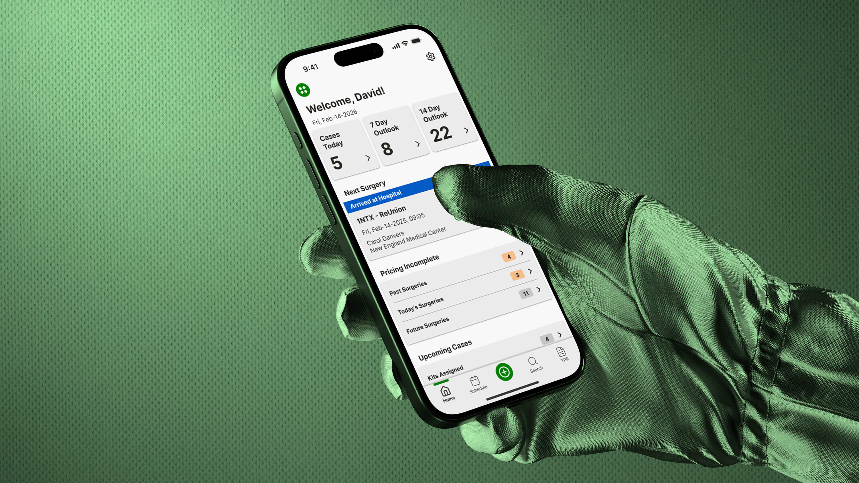
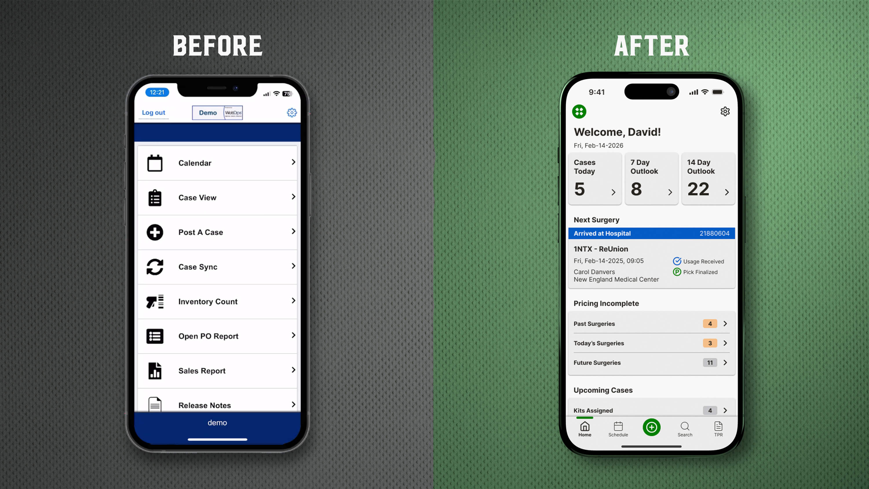
When I joined WebOps, the mobile app functioned primarily as a navigation hub. The homepage presented a list of modules — Case View, Calendar, Inventory, Reports — requiring sales reps to interpret the system structure before taking action. While functional, this approach reflected internal architecture rather than the sales rep's daily priorities.
Through collaboration with WebOps and their enterprise client, we clarified the platform's core job of tracking and managing active surgery cases and their associated products.
We streamlined the experience by:
The redesigned homepage answers one question quickly: "What needs my attention right now?"
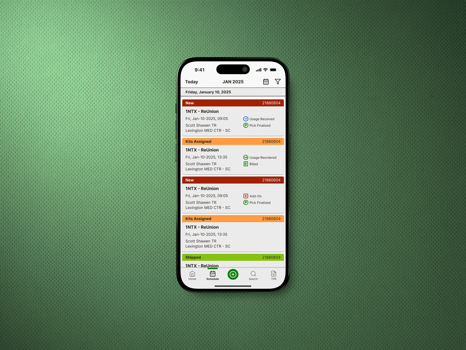
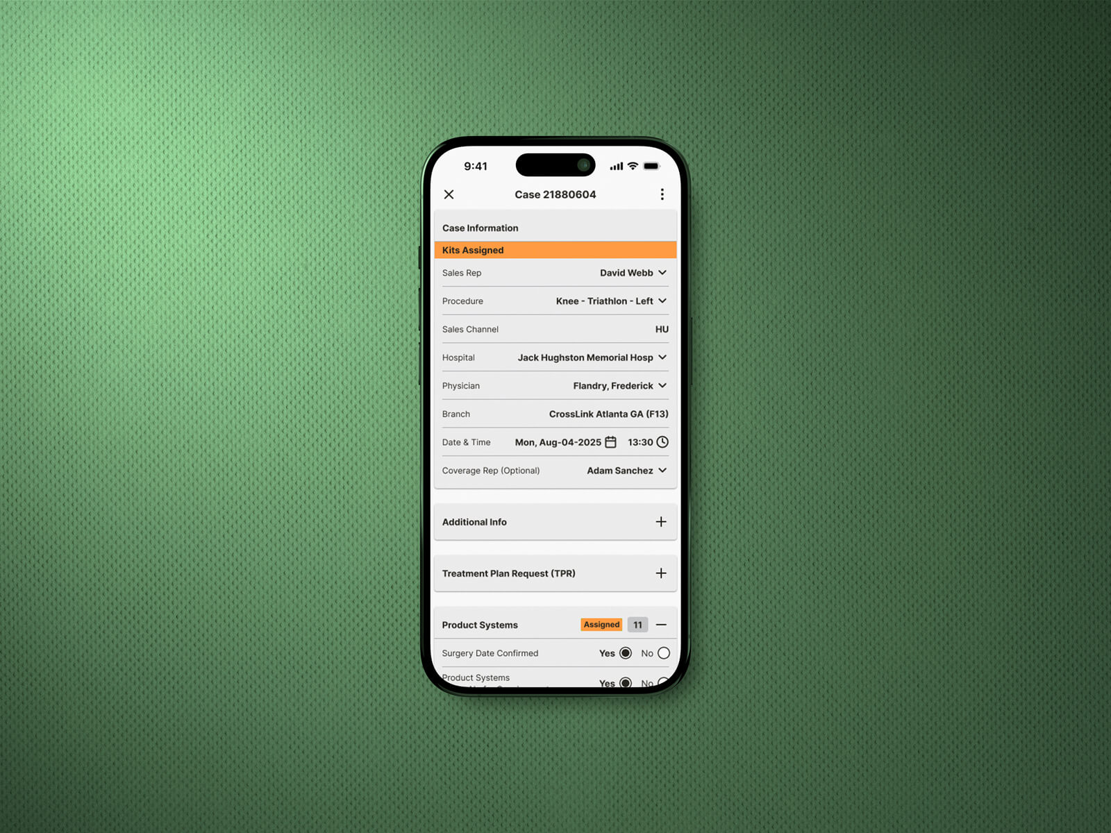
With the homepage reframed around operational priorities, the next phase focused on strengthening the core workflows that powered case management: case details, product assignment, and pricing logic. The goal was consistent across each area: reduce cognitive load, make status and next steps obvious, and ensure every flow was fast to use in the field and straightforward to build and maintain.
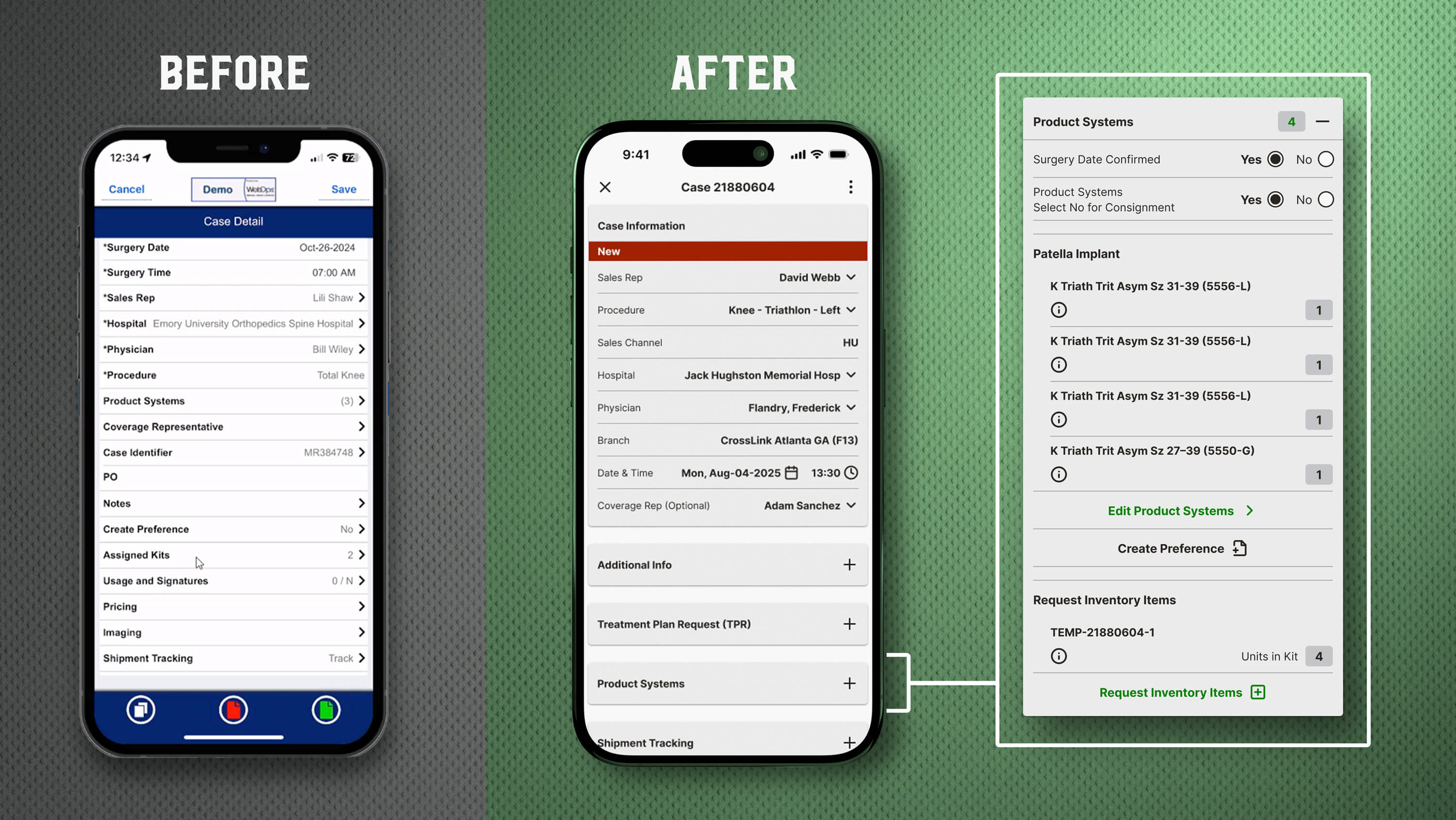
The old Case Detail screen presented a long, flat checklist, making reps scan, hunt, and remember where actions lived.
I restructured it into a modular layout that supports quick scanning first, with progressive disclosure for depth when needed.
Key improvements included:
The result was a case view that supports real-world scanning behavior: quick confirmation when things look good, and fast entry points when they don't.
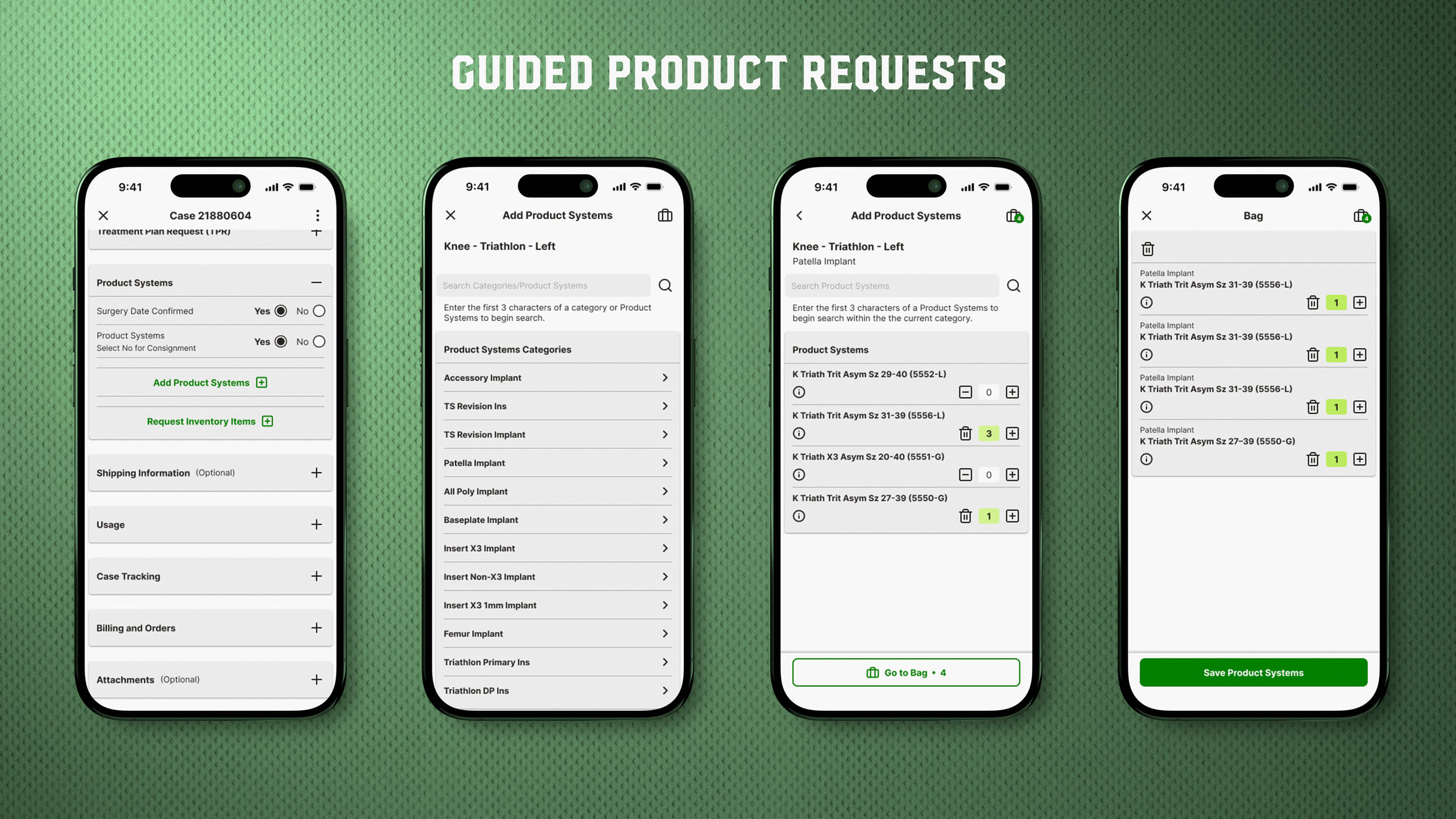
Product requests previously required deep navigation and offered little feedback, creating uncertainty and backtracking.
I redesigned it as a guided "shopping" workflow: browse by category, refine the list of products, add with quantity controls, and confirm with confidence.
This became a reusable pattern for other "choose and confirm" workflows across the platform.
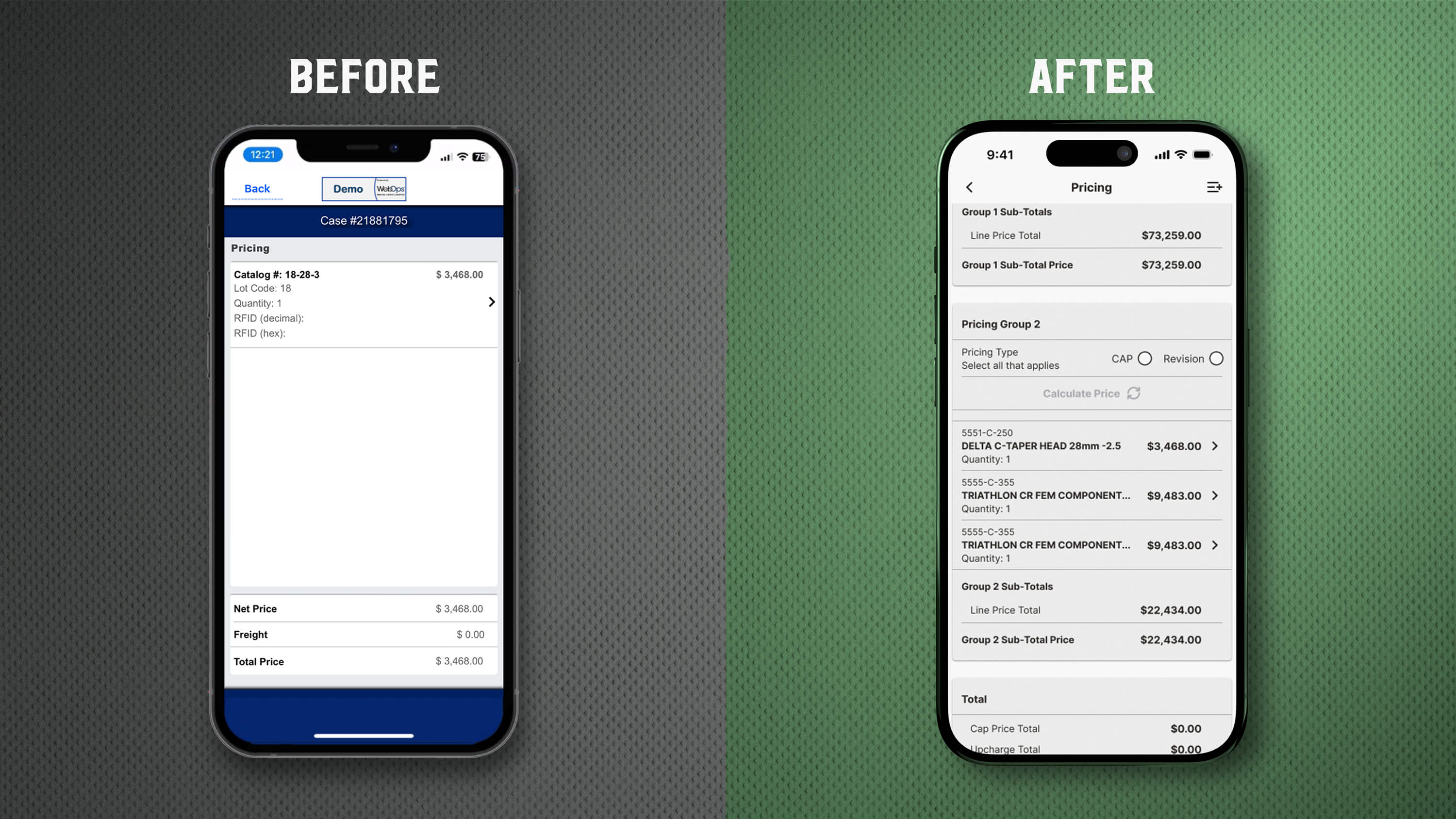
WebOps needed to support complex group pricing rules while keeping the experience predictable for reps moving fast.
I translated that logic into a structured flow: define a group, add items, calculate, review totals, then save.
Design decisions that made this work:
Complexity is inevitable in enterprise systems. Confusion is optional.
As patterns emerged across cases, product selection, and pricing, I formalized them into a cohesive design system to prevent drift and support faster delivery.
The system standardized typography, spacing, layout, containers for structured workflows, and component states so designs stayed consistent and implementations stayed predictable.
Result: less ambiguity for engineering, more cohesion across releases, and a foundation the product could scale on.
This engagement helped WebOps shift from a feature-heavy mobile app to an operational tool built around real field workflows.
If you're building enterprise software and want clarity, speed, and scalable patterns without losing depth, let's talk.


